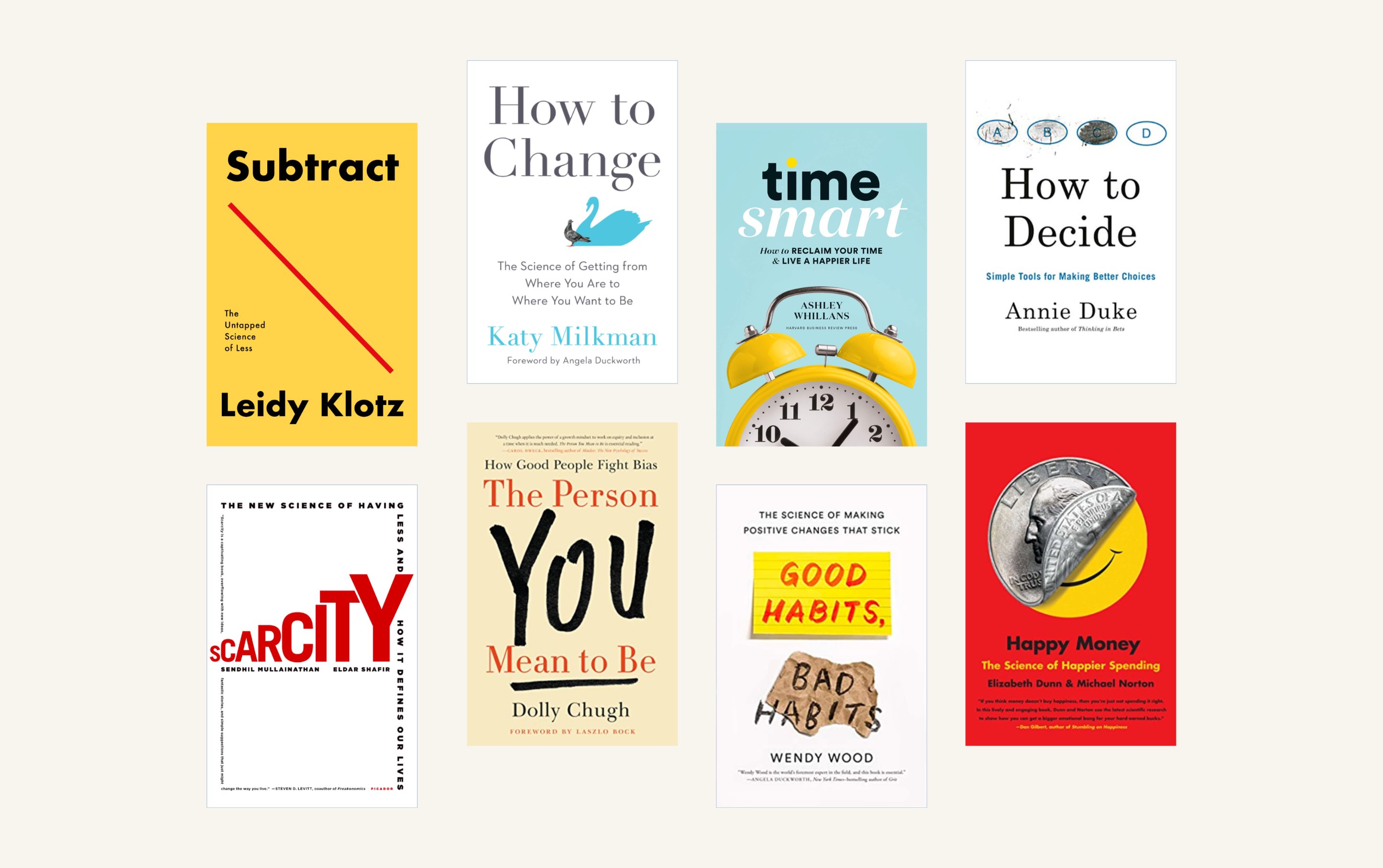
I like the format in which Nicky Case delivers information. It's "alive" and a fun way to acquire information. He is "coding" his knowledge, using visual images with javascript. Art and technology. How to remember anything forever-ish is a good example of that.
A reader can "play" with information to see what it means and how it changes in different settings.
And I want to implement this into the book. Need to limit my imagination with javascript abilities (almost anything is possible with a web book), but I definitely want to improve the delivery of information from a screen to a reader.
Thinking and perception are inseparably connected to vision.
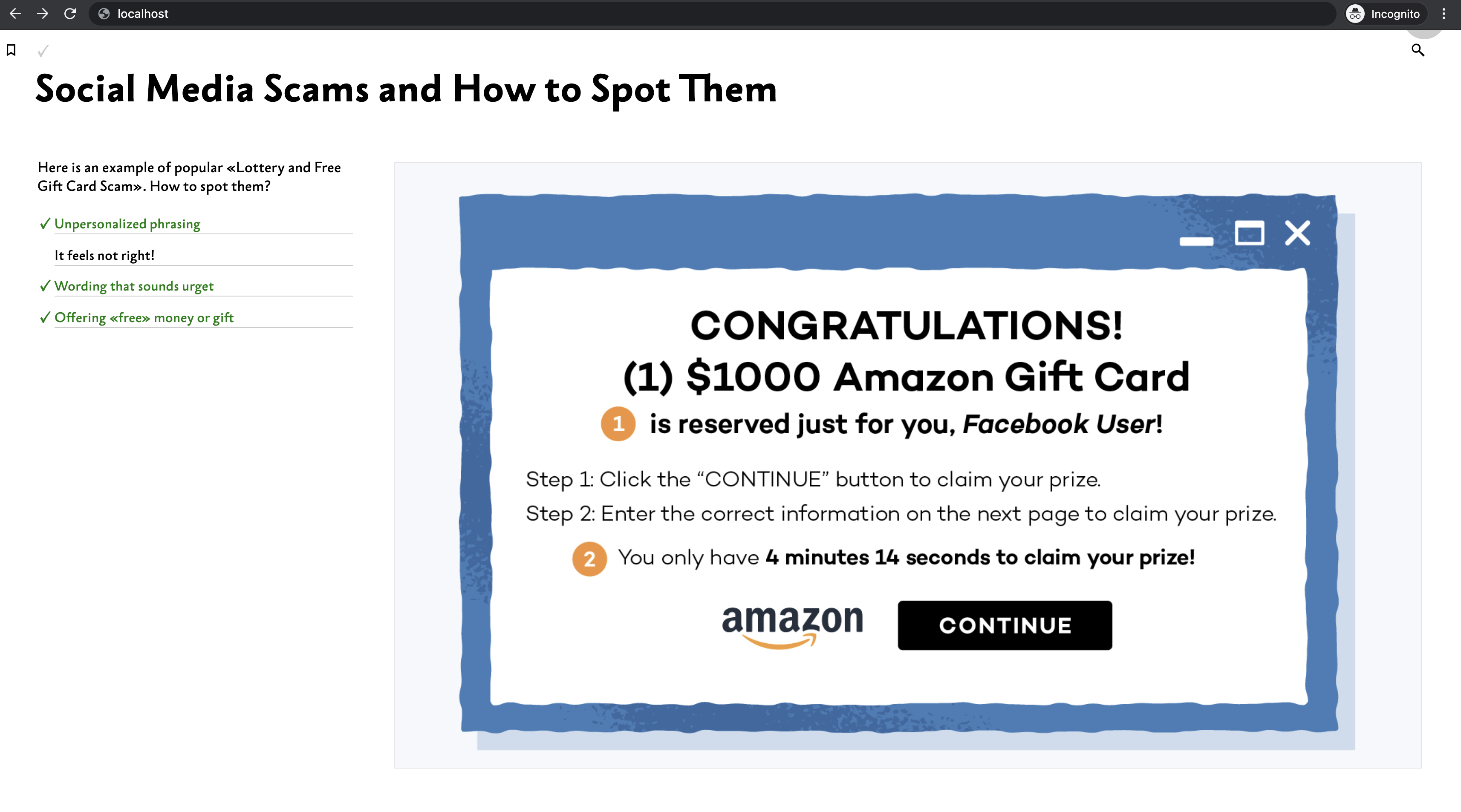
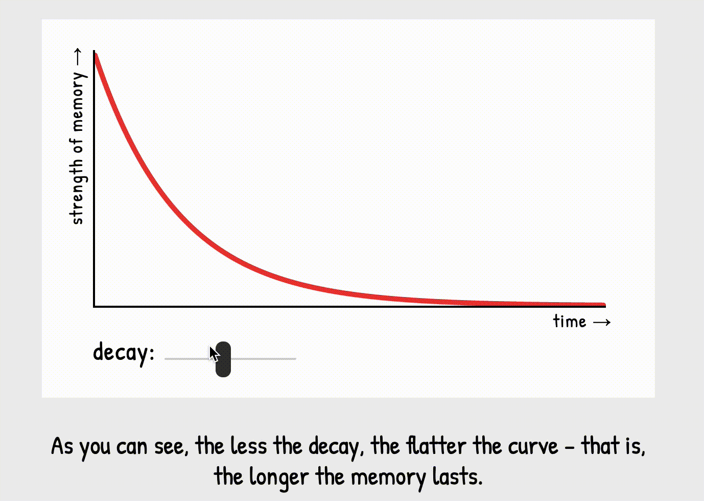
Here is an example from Nicky's page. To me, personally, each picture provides a lot of stimulus and I need to switch between the author's comments to what is actually happening in the picture. Controlling what the reader has in sight seems a good design strategy.
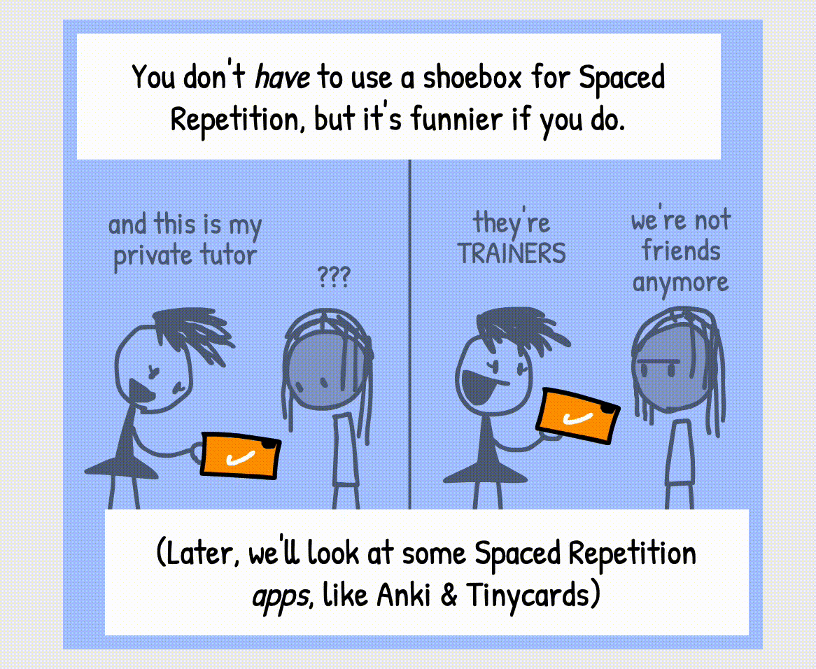 tiny bit of How to remember anything forever-ish.
But what if here is not a scrollable web page with documents, but rather a book with its specific use cases (security in mine). Author works with a book as with an integral object, directing the reader's attention to a specific place with information - a unit of meaning. Just a quick remix of information gives amazing results (I used same pictures and information copy/paste, but differently representing it):
 @ncasenmare's same content with my visual presentation.
Or even this example makes a big difference (maybe I am biased 🤷♂️)
 added ability to write descriptions under images 🙌
The book is intended for continuous reading and requires full attention of the reader. Therefore, the spreads of the book entirely occupy the window and the field of vision of the reader. Text on the spread can be scrolled, when necessary, and the illustrations will retain their position on the screen, or vice versa.
Definitely I should learn more about ways to deliver any kind of information. This blog post is chaotic and full of blinking gifs, hopefully will provide more sensible examples where readers can “touch” and experience it themselves.

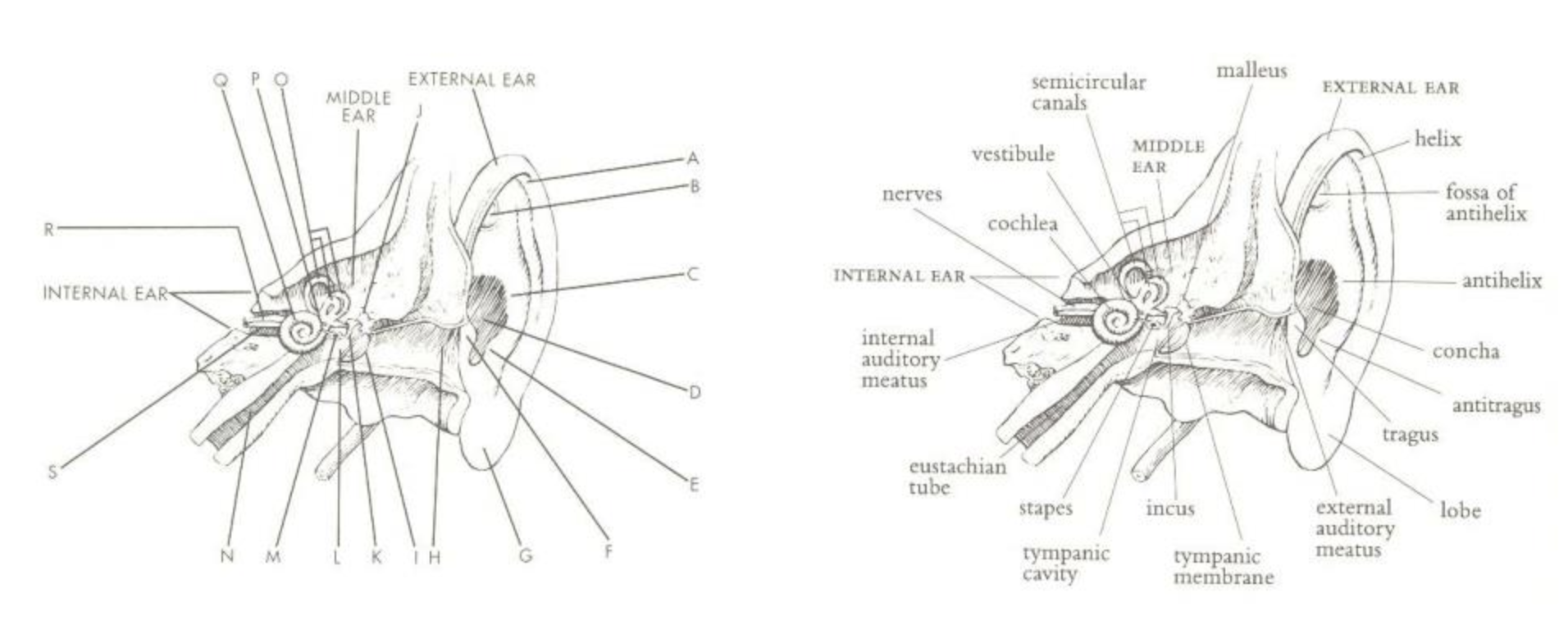 Visual Explanations Images and Quantities, Evidence and Narrative. by Edward R. Tufte.
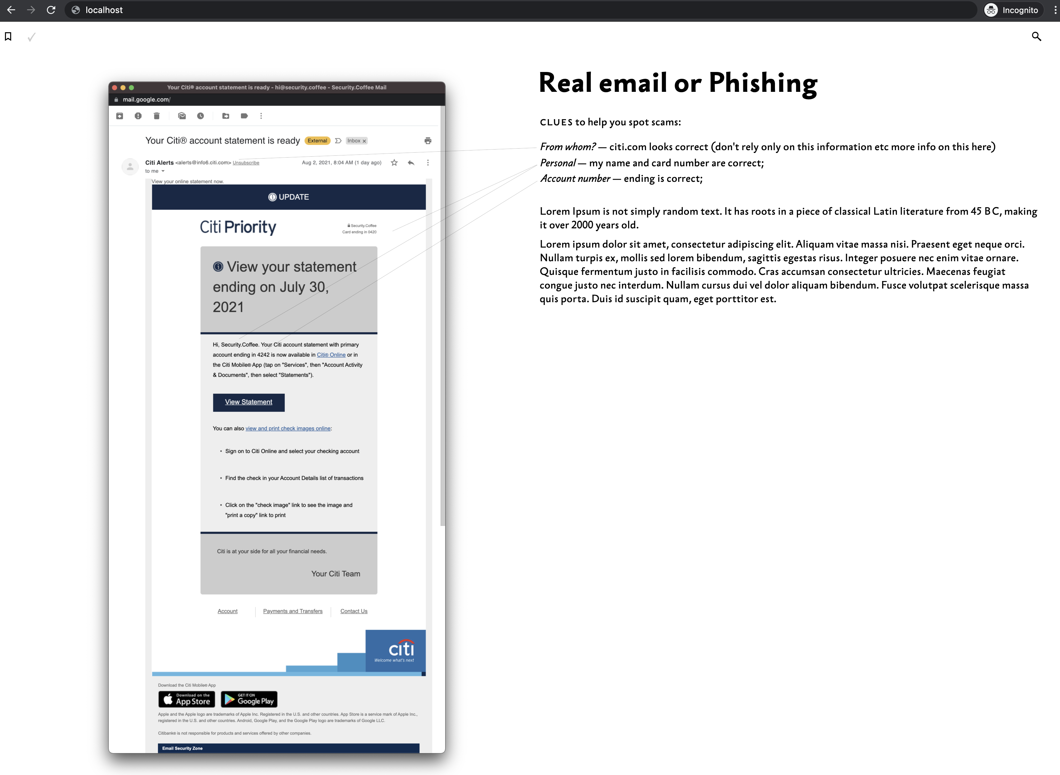 My example of using pointers/lines to show important information on the screenshot.